Calabria to Map (Outcome)
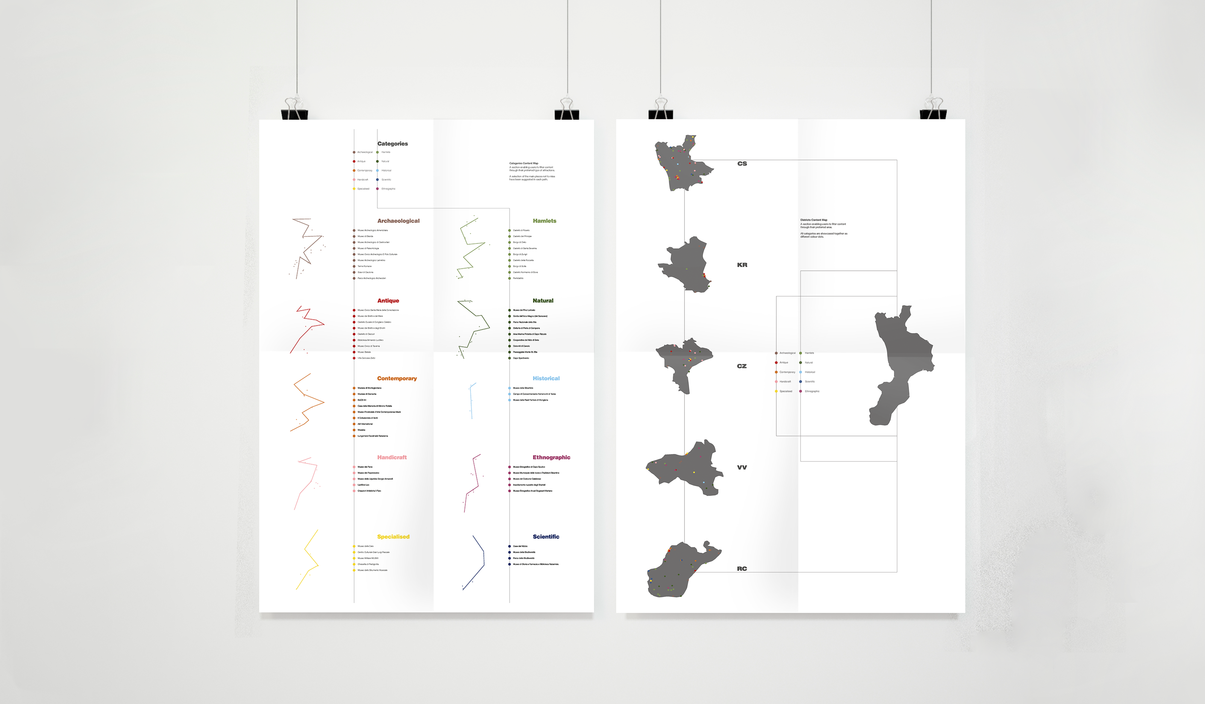
Calabria to Map is my final project for the Pg Dip in Visual Communications for Design. The main outcome is this animation I made in After Effects. It previews the launch of a cultural digital service for Calabria, my region of provenience in the South of Italy. The animation is intended to give its viewers an understanding of the website functionality. The website will have two possible user journeys accessible from the home page: 1) one for who wants to explore the region’s cultural patrimony from top to bottom starting from selecting a category, also called cultural path and 2) another for who knows what district to explore but not what kind of cultural attraction. Being a completely new service to its users, the animation features pop-up notifications (based on the cursor) that give advice on how to best access information and exploit all features (e.g. selecting a custom cultural path).
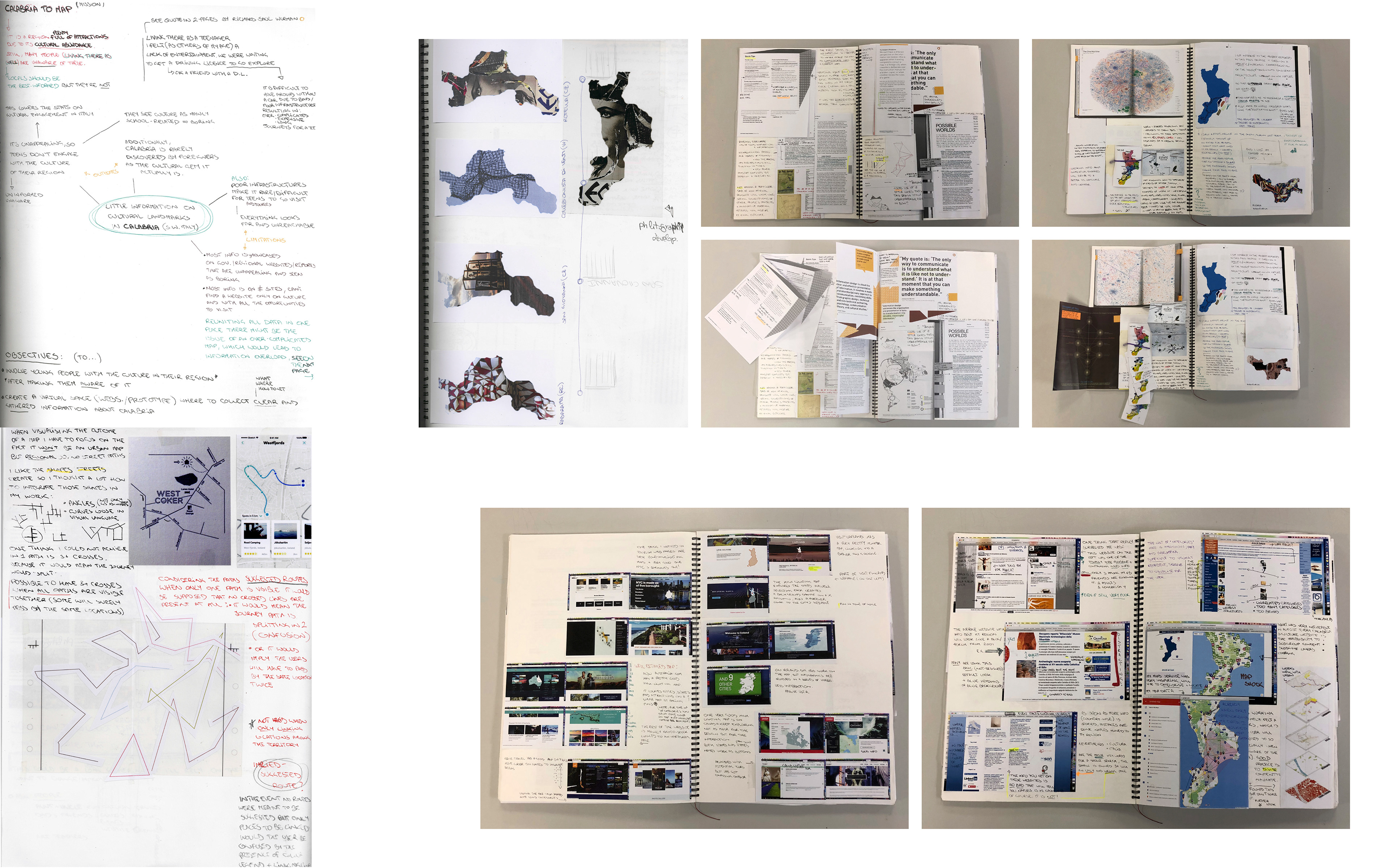
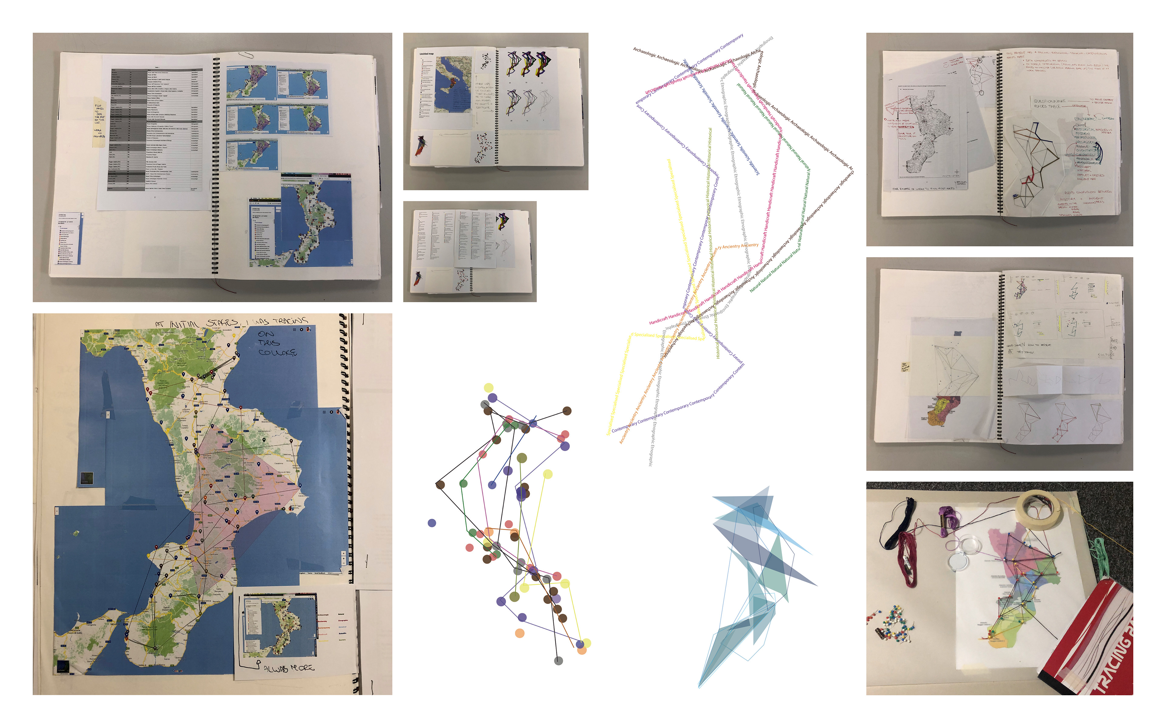
I begun this research because there is a severe lack in the communication of cultural information in Calabria. Beautiful cultural landmarks are all over the territory but few are the people who visit them or are aware of where they are. This is real especially among the youths, hence I targeted generation Y&Z. I researched ways to make culture accessible and appealing to young people. As first step I defined what the problem is. Mind maps and reports with primary research (i.e. a questionnaire and communication with the audience) aided me to formulate a contextual statement. Meanwhile, I hypothesised eventual responses, reason why I begun researching on cartography, way finding and information design. Further, I documented and analysed what already existed among websites and apps. I made a collection of existing websites on Calabria’s cultural patrimony and critiqued their way of organising and presenting information. I evidenced very “old-fashioned-forum-styles” of showing information and shortfalls in the websites accessibility which resulted in information overload. Additionally, I critiqued how the existing websites categorised the variety of a such broad patrimony, in order not to repeat their mistakes and confuse my future users.
Beside the animation I made two A2 posters that were printed in Reprographics at LCC. Aiming for differentiation of content I opted to make one poster for each of the website’s user journeys, explaining with very brief text the different aims of the two.